Colour is something you encounter constantly, often without giving it much thought. It influences what you notice first, how something makes you feel, and even whether you trust what you see. You might be researching this topic because you want to improve your design skills, understand emotional reactions to colour, choose better combinations for creative projects, or simply make sense of why certain colours feel “right” together.
What’s in This Guide?
This guide offers a clear framework for understanding colour theory and psychology, explaining how colours work and interact, and why they carry emotional and symbolic meaning. It breaks down the colour wheel, explains how colour categories are formed, and clarifies key concepts that often cause uncertainty.
Jump to:
- What Is Colour Theory?
- Colour Basics: Understanding How Colour Works
- The Colour Wheel Theory
- How the Colour Wheel is Structured
- Colour Scheme Categories on the Colour Wheel
- Using Colour Scheme Categories in Design
- Colour Beyond the Wheel: Pigment and Light
- Colour Psychology Theory and Emotional Response
- Colours and Their Meanings in Psychology
- Frequently Asked Questions About Colour Theory
- Study Colour Theory for £29
What Is Colour Theory?
Colour theory is a set of principles that explains how colours are created, how they relate to one another, and how they affect perception. It helps explain why certain colour combinations feel balanced, why others clash, and how colour can influence everything from mood to behaviour.
Colour Basics: Understanding How Colour Works
Colour theory begins with how colours are formed and perceived. This includes understanding light, pigments, and how different systems create colour in different ways.
Additive vs Subtractive Colour
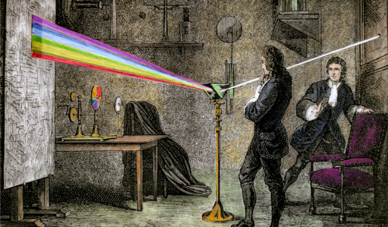
One of the most important distinctions in colour theory is the difference between additive and subtractive systems.
- Additive colour is based on light and is used in screens, televisions, and digital displays. The primary colours are red, green, and blue. When combined at full intensity, they create white light.
- Subtractive colours are used with physical materials such as paint, ink, and dyes. This system relies on pigments absorbing light. The primary colours are cyan, magenta, and yellow. This approach is known as subtractive colour theory, and when people mention subtractive colours, they are referring to this pigment-based system.
Understanding the difference between these two systems makes it easier to predict colour outcomes and avoid frustration when working across digital and physical formats.
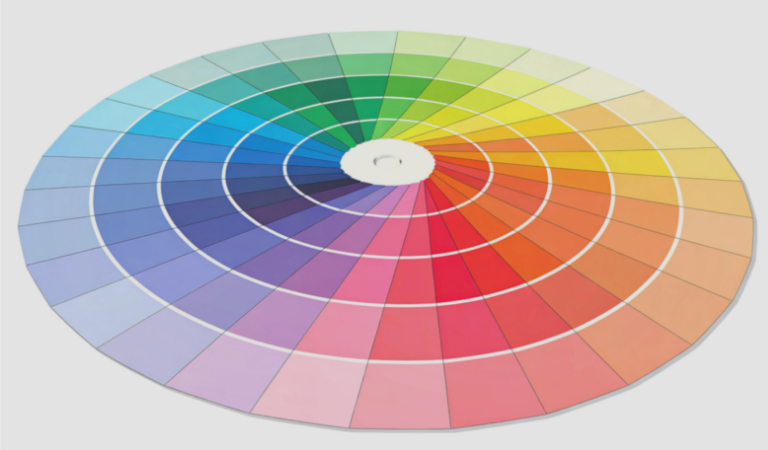
The Colour Wheel Theory
The colour wheel theory is one of the most effective tools for understanding how colours work together. Rather than listing colours randomly, the wheel arranges them in a circular format to show their relationships. This makes it easier to understand harmony and contrast when choosing colour combinations.
A colour wheel simple enough for beginners usually includes primary, secondary, and tertiary colours arranged in a clear sequence. These colour wheel colours are placed deliberately to show how colours transition and interact.
How the Colour Wheel Is Structured
Most traditional colour wheels are built around three main groups. Primary colours form the foundation, secondary colours are created by mixing primaries, and tertiary colours sit between them. More detailed types of colour wheel may also include tints, shades, and tones to show how colours change when lightened or darkened.
Colour Scheme Categories on the Colour Wheel
The colour wheel does not just show colours, it also helps organise them into colour scheme categories. These schemes are based on how closely colours sit to one another on the wheel and how much contrast they create.
1. Monochromatic Colour Schemes
A monochromatic colour scheme is built using a single colour from the colour wheel and varying it through lighter and darker versions. This means working with tints, shades, and tones of one hue, rather than introducing additional colours.
Monochrome colours are often used to create cohesive designs because they reduce visual complexity and help elements feel naturally connected. By changing brightness and depth instead of hue, interest is created without overwhelming the eye. Common monochromatic colour examples include layered greys, soft blues, or warm neutral palettes.
Monochromatic colour schemes are particularly popular in interiors and branding, where consistency and clarity are important. They’re easy to manage and create a sense of balance, making them a strong choice for designs that aim to feel minimal or soothing.
2. Analogous Colour Schemes
Analogous colours sit next to each other on the colour wheel and share similar undertones, which is why these combinations feel natural and visually comfortable. Because the colours are closely related, they tend to blend smoothly rather than compete for attention.
An analogous colour scheme might include blue, blue-green, and green. The focus is on harmony rather than contrast, making these schemes ideal for relaxed and visually unified designs.
They’re often used in interiors, branding, and artwork where a calm, cohesive mood is preferred, and they work particularly well when one colour is allowed to dominate while the others play a supporting role.
3. Complementary and High-Contrast Schemes
Complementary colour schemes use colours that sit opposite each other on the colour wheel. These combinations create strong contrast and visual energy, which can make designs feel bold and attention-grabbing.
Because complementary colours naturally compete for attention, balance is essential. When opposing colours are used in equal intensity, the result can feel overwhelming. High-contrast schemes tend to work best when one colour is allowed to dominate, with the opposing colour used more sparingly to highlight key elements.
One commonly used guideline for managing contrast is the 60/30/10 rule for colours. This approach suggests using one dominant colour, one supporting colour, and one accent colour, helping maintain visual harmony while still allowing contrast to stand out clearly.
Using Colour Scheme Categories in Design
Colour theory in design relies heavily on these colour scheme categories. They help guide decisions in branding, interiors, fashion, and digital spaces by providing a clear framework.
When selecting the best colours for a logo, for example, designers often return to the colour wheel to assess how colours relate, contrast, and communicate emotion. Colour theory supports these decisions by offering clarity and intention.
Colour Beyond the Wheel: Pigment and Light
While the colour wheel explains relationships, not all colour behaves in the same physical way. Some colour comes from pigment, while others are created through light itself.
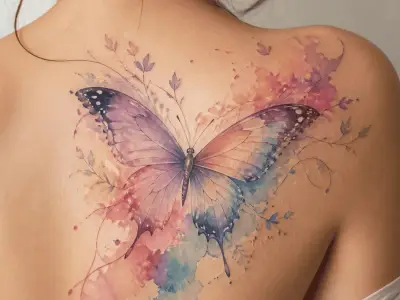
- Structural colour occurs when light interacts with physical structures rather than pigments. Structural colouration is responsible for the effects seen in butterfly wings and peacock feathers.
- Iridescent colour changes depending on viewing angle, which is why iridescent colours appear to shimmer and shift. Pure structural colour relies entirely on light behaviour rather than pigment colour.
- Pigment colour works differently, as it comes from substances that absorb certain wavelengths of light. It’s the most familiar form and is used in paint, ink, and fabric dyes. Understanding the difference between pigment and structural colour explains why some colours fade while others remain vibrant.
Colour Psychology Theory and Emotional Response
Colour psychology theory looks at how colours affect emotions, mood, and behaviour. Rather than being purely decorative, colour has a psychological impact that shapes how people respond to environments and designs, often before they’re consciously aware of it.
Colours are closely connected to emotional responses, though emotional colour responses are not fixed. Reactions are influenced by culture, memory, and personal experience, which means the same colour can feel comforting to one person and unsettling to another.
This is why colour psychology design focuses on context as much as meaning. Designers use colour intentionally to guide mood, highlight information, and create emotional resonance rather than relying on colour alone to communicate a message.
Colours and Their Meanings in Psychology
Colours carry emotional, psychological, and symbolic meanings that influence how you feel and how you respond to people, spaces, and designs. Here are some key interpretations for each colour:
- Red: Often associated with passion, love, energy, and urgency. Red is one of the strongest emotional colours and is frequently linked to desire and excitement. It’s also commonly connected to the colours of love.
- Pink: Associated with affection, compassion, and nurturing feelings.
- Blue: Linked to calm, trust, and stability. Blue is also widely recognised as the colour of sadness, which is why it is often associated with reflection and introspection.
- Yellow: Commonly connected to optimism and creativity. Yellow is often seen as uplifting, though excessive use can feel overwhelming.
- Green: Associated with balance and renewal. Green is often linked to nature and emotional stability, making it a calming and grounding colour.
- Orange: Represents enthusiasm and motivation. Orange blends the energy of red with the positivity of yellow, creating a lively and sociable feeling.
- Purple: Often linked to imagination, spirituality, and mystery. Purple has historically been associated with luxury and deeper emotional awareness.
- White: Symbolises simplicity and purity. White is commonly used to create a sense of openness.
- Black: Associated with power and depth. Black can feel elegant and authoritative, though it may also represent seriousness or grief depending on context.
- Grey: Represents neutrality and restraint. Grey is often used to create a calm and stable atmosphere without strong emotional influence.
- Brown: Connected to comfort, reliability, and grounding. Brown often feels warm and secure, closely associated with the natural world.
- Gold: Symbolises success, achievement, and value. Gold is frequently used to suggest celebration.
- Silver: Associated with modernity and reflection. Silver often conveys sophistication with a cooler, more understated tone than gold.
Frequently Asked Questions About Colour Theory
What are the colours of love?
Red and pink are most commonly associated with love due to their links with passion and emotional warmth. These associations are deeply rooted in cultural symbolism and storytelling, which is why they appear so frequently in romantic contexts.
What Is the Purest Colour?
A pure colour is a hue that has not been altered with white, black, or grey. These fully saturated colours appear bold and intense. In practical use, they are often softened to create comfort and balance while still retaining clarity.
What are the four colour personalities?
Four colour personality systems typically use red, blue, yellow, and green to group personality traits and communication styles. These colours are used to reflect dominant tendencies, such as leadership, analytical thinking, sociability, and emotional sensitivity.
How do I find out my colour theory?
Begin by observing which colours you are naturally drawn to and how they make you feel in different contexts. Exploring colour theory through everyday examples, such as interiors, fashion, or branding, helps build understanding over time.
Can I do a colour analysis on myself?
Personal colour analysis can help you identify shades that complement your natural features and personal style. While results are subjective, many people find the process useful for building confidence in their colour choices.
What is an example of colour theory in action?
A well-balanced interior using an analogous colour scheme, a logo designed to communicate trust through colour, or a website that feels intuitive to navigate are all practical examples of colour theory at work. These applications show how colour relationships and psychology combine in real-world settings.
Recommended for you!
Best Sellers


Study Colour Theory for £29
If you would like to explore colour theory in greater depth and gain practical skills you can apply confidently, the Colour Theory Diploma Course explores how colours influence emotion, perception, creativity, and communication in everyday life. You can enrol now for a discounted price of £29, making it an accessible way to build confidence and knowledge in colour theory.
If you would also like to join our learning community, unlock exclusive discounts, and receive expert tips, you can sign up for our mailing list.